Back in my Exfanding days, I wrote at length about attending Otakon, PAX East, and New York Comic-Con. I've been to other conventions since then—Castle Point Anime Convention and Trekonderoga, off the top of my head—but you'd never know it from this blog. It's been several years since I've posted anything about a convention experience, and my last attempt was essentially a self-reminder to have fun at conventions. I must have internalized my own advice pretty well, because I had a fantastic weekend at AnimeNEXT 2018.
...Wait, didn't I just get back from AnimeNEXT 2019? Apparently I've been sitting on a half-written convention writeup for the past 11-12 months, so I'd better discuss last year before moving on to this year. Here goes.
THURSDAY
I scooted out of work a bit early, picked up my wife, and began the trek to Atlantic City, NJ. My wife and I are relics from the era of putting together mix tapes for car trips, so she had burned a CD for the occasion: an assortment of intro and ending songs from anime series we'd watched together in the last few years. There's nothing like tunes from Bleach, Silver Spoon, Restaurant to Another World, Kill la Kill, Yuri on Ice!!, Himouto! Umaru-chan, Arpeggio of Blue Steel, Valerian and Laureline, Magical Girl Ore, Kakuriyo: Bed and Breakfast for Spirits, Bodacious Space Pirates, Free!, Orange, Little Witch Academia, and the original Devilman to get you pumped for sitting around in traffic. And there's nothing like the preceding list of titles to get you to question our taste in anime.
Our first destination was actually just outside Atlantic City—we had a room reserved at the historic Joseph Pitney House in Absecon. Ever since our honeymoon, my wife and I have been staying at bed and breakfasts instead of hotels whenever we have the opportunity; the food, hospitality, and unique charm are often as memorable as whatever we're in town to see or do, plus we tend to get better prices and quieter neighbors than we would at a hotel. We arrived fairly late in the evening, picked up our room key, visited the always-open snack pantry for some homemade shortbread, and settled into our spacious room.
We missed the window to check in early at the convention, so we didn't have our schedules and program booklets to be able to plan out our first day. Instead, my wife doodled around on her tablet while I read a book (specifically, Live From New York, a fascinating and highly entertaining collection of interviews recalling the first few decades of Saturday Night Live). My wife laughed about how we were spending the first night of our vacation doing exactly what we'd be doing at home. "Yeah," I responded, "but we don't have to worry about cleaning, or cooking, or going to work tomorrow; everything's taken care of, and we can relax without feeling like there's something else we should be doing."
I cannot begin to articulate how comfortable the bed was—once my head hit the pillow, the world beyond the bed ceased to exist. It was magnificent.
FRIDAY
The world beyond the bed reasserted its existence at 5:30 AM. My wife had a different costume planned for each day of the convention, and today's required over 2 hours to prepare. Taking into account when breakfast would be served, how long it might take to find parking at or near the venue, and how long the registration line was likely to be, we resigned ourselves to an unpleasantly early morning. Fortunately, I was cosplaying as "dude attending an anime convention," so I went back to sleep.
Eventually, I left the bed to pursue the "and breakfast" part of the arrangement, and it was delightful. Vanilla yogurt parfait with granola and berries (I'm not big on berries, but I'll eat them if sprinkled sparingly on yogurt parfait), followed by a two-egg omelet and a glass of orange juice—enough to fuel me through the start of the convention.
I get anxious driving around unfamiliar urban areas, what with their endless traffic lights and surprise one-way streets and claustrophobia-inducing architecture right up against the sidewalks, but the drive to the convention center was downright pleasant. There was plenty of parking onsite at the convention center—and as I would later discover, there were several food vendors and even a train station onsite, making this the most convenient convention venue I think I've ever been to.
I remember PAX East being obnoxious because the layout made no sense and there were waiting lines for everything (my wife refers to it as "Line Con"). I remember it taking forever to get around Comic-Con because of the incredible masses of people everywhere. The last Otakon I attended was uncomfortably over capacity, to the point where even the restaurants outside the convention center were overrun by otaku at all hours. As a midsized convention in a well-organized space, AnimeNEXT had none of these problems. The convention never got in the way of the convention, if that makes sense.
AnimeNEXT had the dealers' room, video game room, and concerts on the second floor; all the panels and screenings on the third floor; and all the niche events and novelty rooms (eg, the Cosplay Repair room, which I think is a brilliant idea) on the fourth floor. Escalators were plentiful and logically placed; and the design of the convention center gave every level a good view of the ground floor, where audience-participation events such as a cosplay wrestling tournament would occasionally occur. I also have to credit the building staff—from the folks in the parking garage to the folks at the front desk—for being friendly the entire weekend, and for being incredibly helpful every time I approached them with a question (mostly pertaining to food).
Of course, the first order of business was getting through the registration line. Ahead of us in the lobby was a group with one person cosplaying as Shrek, and someone in the group periodically used their smartphone to play a selection from the Shrek soundtrack to get us pumped for standing around in line. We struck up conversations with other attendees as the line snaked back and forth, commenting on one person's clever "Shyguys Burgers and Fries" t-shirt, praising an excellent Castle Crashers costume, and asking about a superb Stephen Universe cosplay we didn't recognize because we'd never seen Stephen Universe. I swear this was an anime convention.
Oh, but that was just the line to get into the registration line. Once we made it through the big doors into the registration area (which was the size of a basketball court), we split off into the queue for people who preregistered for tickets. There we encountered new cosplayers, such as Blair from Soul Eater, whom I mistook for I-No from Guilty Gear because my brain still thought we were at a video game convention. The hardest part of appreciating convention cosplay is that, as my wife put it, it's like playing one big trivia game all weekend. "Name that character." Which gets harder and harder with every passing year, thanks to new characters I've never heard of and old characters who've slipped my mind.
Case in point: my wife was cosplaying as Ujibe, the coach from Keijo!!!!!!!! (yes, there really are that many exclamation points in the title), and not a single person made any indication that they recognized her. This was a little heartbreaking to me, knowing the effort she had put into this costume. She had painstakingly reviewed clips and screencaps from the show to ensure every detail of her outfit was accurate. She had hand-dyed her shirt in an involved process using tea and tumeric. She had hand-stitched the clover logo on the shirt (never mind that it was rotated 45 degrees; it was late, she was tired). She had spent the morning styling her wig and beauty mark to precise specifications. I was proud of her for what she pulled off.
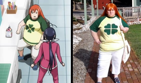
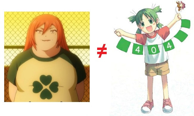
Granted, Ujibe is a side character in an anime that a lot of people might not admit to watching, on account of its subject matter. (I swear I watched it for the story, but it's about girls in bathing suits hitting each other with their butts.) However, I think my wife hit the nail on the head: she believes people just aren't accustomed to seeing plus-size women cosplaying as plus-size women. If people assumed my wife was pretending to be one of the bajillion characters as scrawny as Sailor Moon, of course they wouldn't recognize her costume. This would account for why one dude thought she was the 4chan mascot.
Anydigression, as soon as we cleared the registration line, we sat down with our schedules and mapped out the first half of our day. I marked up anything that seemed remotely interesting (I wanted backup plans, in case anything was a dud or too full to get into), but I opted to follow my wife around whenever there was any overlap in our interests. Our last Otakon was marred by the logistical frustrations of trying to meet back up with people after going off to do our own things, and I was more concerned about having a fun convention together than getting to do and see everything I wanted most.
Japanese Feminism 101: In our first dynamic panel of the day, we waited about half an hour for the presenter to show up. Around 11:35, one of the convention staff wandered in to see why we were sitting around in an empty room. Apparently, there had been schedule changes since the agenda was printed.
Look, I understand that plans change. But nobody at registration told us about it. Nobody put up a sign. Although we later discovered that the most current room schedule was displayed in a tiny box beside the door, that didn't help anyone trying to plan their day before they got to the room. I asked the staff at the information desk whether they had a list of corrections to the printed agenda. Not only did they seem surprised about there being schedule changes, but they directed me to view the updated schedule online—which is a poor solution for anyone who doesn't have a smartphone or has to deal with roaming data in a place with no public Wi-Fi. We eventually noticed a widescreen monitor rotating all the events and their locations for the next couple hours—not ideal, but better than nothing.
Game the Gamer: With an unexpected hole in our schedule and the dealers' room not yet open to the public, we wandered over to the only event that wasn't already deeply in progress. The premise of "Cutthroat Kitchen, with Wii games" sounded like a decent use of the next hour, but I started to lose interest when too much time was being spent auctioning off more sabotages than I felt were necessary for the first round. I stuck around long enough to see one of the contestants attempt WarioWare: Smooth Moves while handcuffed to a chair; my wife stayed for the whole thing, but I headed out somewhere around when they were trying to get someone to play Smash Bros. with a Wii bowling ball.
Kaibyo: The Supernatural Cats of Japan: I'm sorry I missed the beginning of this, because I'm interested in Japanese mythology and folklore, the presenter (Zack Davisson) was very engaging, and I'm enough of a cat person that my wife and I meow at each other as a form of communication. At least I got there in time to laugh about cats who gain power from wearing silly things on their head, see the tragic portrait of a cat minstrel playing a shamisen (an instrument that would have been partially constructed of cat leather), and learn about the origin of Japan's fondness for catgirls. The Japanese government at one point prohibited artists from drawing or painting people of a certain social variety (eg, prostitutes)—and the artists cleverly got around the issue by creating the exact same art, but with anthropomorphic cats instead of humans.
Lunch: I think I had a barbecue chicken wrap. I'm not a big wrap guy, but that's what they served at Esquires, the food stand in the train station attached to the convention center. I don't know about you, but I don't think of wraps when I hear "Esquires."
Finding Your Anime Voice: I popped in a bit late for what I hoped would be a panel on doing different voices, which would have been helpful for me on Twitch and YouTube with all the dialogue I read aloud while playing games. Unfortunately, the part for which I was present consisted mostly of random audience members trying to speak in a different register (eg, head voice) with minimal coaching. I left after maybe 5 minutes.
Dealers' Room: With an unexpected hole in my schedule and the dealers' room now open to the public, I meandered down to peruse the treasure trove. Geekery in every format was for sale—posters, wall scrolls, books, clothes, figurines, body pillows, DVDs, video games, and so on. Normally, this is where most of my convention budget goes, but I found myself exercising an unexpected amount of self-control.
Much of the merchandise was from new anime series that I hadn't seen or didn't have a special attachment to, so that helped. But I'm also in a different phase of my life than I was the last time I attended a convention with this much for sale. There's very little I actually want anymore—and I'm subscribed to the Star Trek Official Starships Collection, so shelf space in my home is at a premium like never before. I think about all the other ways I could be using my money—bills, charities, clothes that fit.
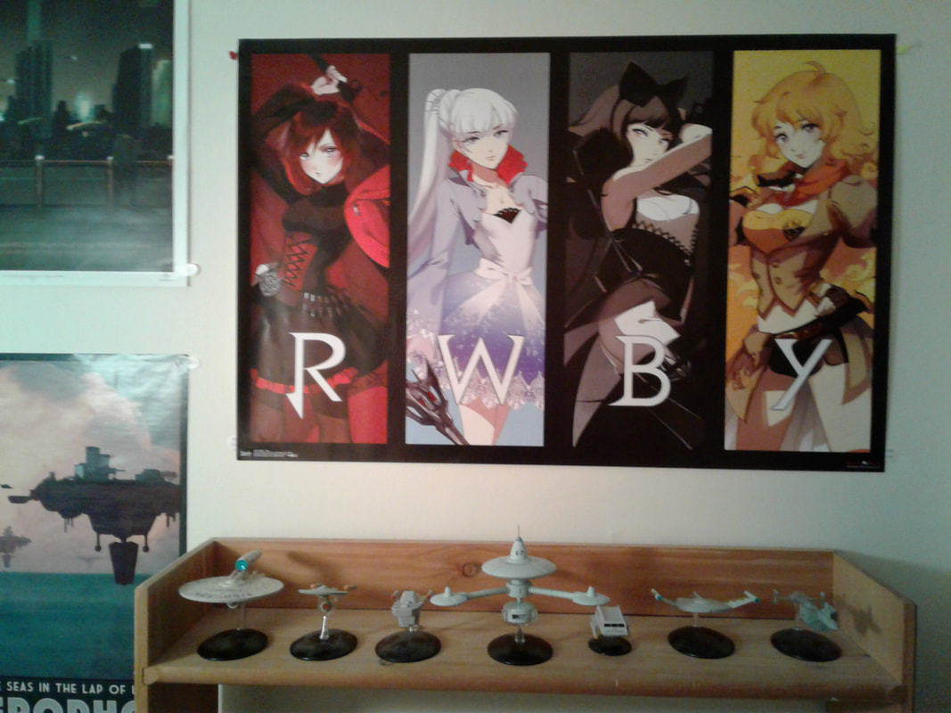
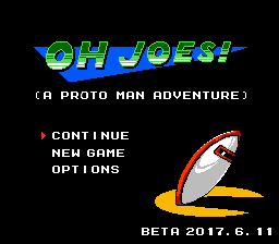
To that end, one of the few things I bought for myself was a t-shirt mashing up Mega Man and Iron Man. I also picked up a copy of the NES game Faxanadu, which has been on my radar for a while, as well as a RWBY poster. I'm particularly happy with the poster, because I had a similar image as a desktop wallpaper for a while and I love the multi-panel aesthetic.
Japanese Feminism 101: In our first dynamic panel of the day, we waited about half an hour for the presenter to show up. Around 11:35, one of the convention staff wandered in to see why we were sitting around in an empty room. Apparently, there had been schedule changes since the agenda was printed.
Look, I understand that plans change. But nobody at registration told us about it. Nobody put up a sign. Although we later discovered that the most current room schedule was displayed in a tiny box beside the door, that didn't help anyone trying to plan their day before they got to the room. I asked the staff at the information desk whether they had a list of corrections to the printed agenda. Not only did they seem surprised about there being schedule changes, but they directed me to view the updated schedule online—which is a poor solution for anyone who doesn't have a smartphone or has to deal with roaming data in a place with no public Wi-Fi. We eventually noticed a widescreen monitor rotating all the events and their locations for the next couple hours—not ideal, but better than nothing.
Game the Gamer: With an unexpected hole in our schedule and the dealers' room not yet open to the public, we wandered over to the only event that wasn't already deeply in progress. The premise of "Cutthroat Kitchen, with Wii games" sounded like a decent use of the next hour, but I started to lose interest when too much time was being spent auctioning off more sabotages than I felt were necessary for the first round. I stuck around long enough to see one of the contestants attempt WarioWare: Smooth Moves while handcuffed to a chair; my wife stayed for the whole thing, but I headed out somewhere around when they were trying to get someone to play Smash Bros. with a Wii bowling ball.
Kaibyo: The Supernatural Cats of Japan: I'm sorry I missed the beginning of this, because I'm interested in Japanese mythology and folklore, the presenter (Zack Davisson) was very engaging, and I'm enough of a cat person that my wife and I meow at each other as a form of communication. At least I got there in time to laugh about cats who gain power from wearing silly things on their head, see the tragic portrait of a cat minstrel playing a shamisen (an instrument that would have been partially constructed of cat leather), and learn about the origin of Japan's fondness for catgirls. The Japanese government at one point prohibited artists from drawing or painting people of a certain social variety (eg, prostitutes)—and the artists cleverly got around the issue by creating the exact same art, but with anthropomorphic cats instead of humans.
Lunch: I think I had a barbecue chicken wrap. I'm not a big wrap guy, but that's what they served at Esquires, the food stand in the train station attached to the convention center. I don't know about you, but I don't think of wraps when I hear "Esquires."
Finding Your Anime Voice: I popped in a bit late for what I hoped would be a panel on doing different voices, which would have been helpful for me on Twitch and YouTube with all the dialogue I read aloud while playing games. Unfortunately, the part for which I was present consisted mostly of random audience members trying to speak in a different register (eg, head voice) with minimal coaching. I left after maybe 5 minutes.
Dealers' Room: With an unexpected hole in my schedule and the dealers' room now open to the public, I meandered down to peruse the treasure trove. Geekery in every format was for sale—posters, wall scrolls, books, clothes, figurines, body pillows, DVDs, video games, and so on. Normally, this is where most of my convention budget goes, but I found myself exercising an unexpected amount of self-control.
Much of the merchandise was from new anime series that I hadn't seen or didn't have a special attachment to, so that helped. But I'm also in a different phase of my life than I was the last time I attended a convention with this much for sale. There's very little I actually want anymore—and I'm subscribed to the Star Trek Official Starships Collection, so shelf space in my home is at a premium like never before. I think about all the other ways I could be using my money—bills, charities, clothes that fit.
To that end, one of the few things I bought for myself was a t-shirt mashing up Mega Man and Iron Man. I also picked up a copy of the NES game Faxanadu, which has been on my radar for a while, as well as a RWBY poster. I'm particularly happy with the poster, because I had a similar image as a desktop wallpaper for a while and I love the multi-panel aesthetic.
HIATUS
Then I saved this post as a draft and didn't come back to it for almost a year.
My original intention was to pick up where I left off, using the online schedule for 2018 (with the numerous updates not reflected on my print schedule) to jog my memory and organize my storytelling. However, at the time of this post, I can only find online schedules for 2014, 2015, 2016, 2017...and 2019. As much as I want to keep going with the blow-by-blow recap, I recognize that this is a good excuse to scale back the verbosity and focus on the highlights. Nobody needs to hear about the mediocre pizza I ate.
I could regale you with tales of the three minutes I spent at an 18+ panel that I thought would be like Mystery Science Theater 3000 for adults only, but ended up being a YouTuber showing us his skeevy hentai game playthrough videos and creepily talking over his own recorded commentary. I could gush about Anime Burger Time, the BYOB (Bring Your Own Burger) panel where the host chowed down on Johnny Rockets while showing us clips of hamburgers appearing in various anime. I could recount what I recall of the Mazinger Z: Infinity movie, or of the Gaijin Girl: Life in Japan presentation. I could describe the hilarious Bad Anime Bad! panel and invoke the infamous names Garzey's Wing and Titanic: The Legend Goes On.
Instead, I'll attempt to work some untold stories into my writeup of AnimeNEXT 2019, where they'll still be relevant due to how often I found myself thinking back to 2018. If I write in a less comprehensive and detail-oriented format, I may even finish before the 2020 convention. In the meantime, please enjoy some photos from 2018, which we'll pretend are the intended conclusion to this post.
NOTE: If you (you, the reader) are in any of the photos below and don't want to be featured here, or if you'd like to be credited, please let me know (see the main page for contact options) and I'll action your request accordingly.
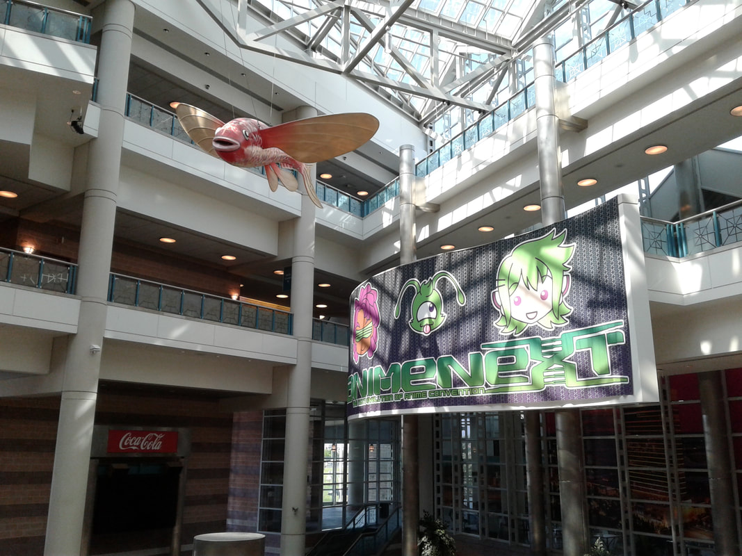
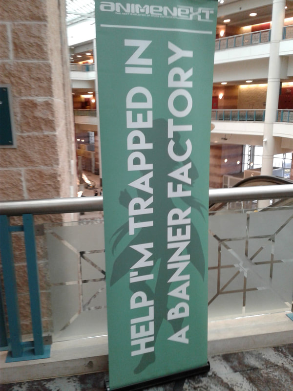
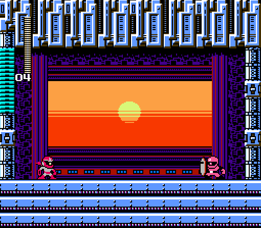
First up, a couple scenes from the convention in general:
Then I saved this post as a draft and didn't come back to it for almost a year.
My original intention was to pick up where I left off, using the online schedule for 2018 (with the numerous updates not reflected on my print schedule) to jog my memory and organize my storytelling. However, at the time of this post, I can only find online schedules for 2014, 2015, 2016, 2017...and 2019. As much as I want to keep going with the blow-by-blow recap, I recognize that this is a good excuse to scale back the verbosity and focus on the highlights. Nobody needs to hear about the mediocre pizza I ate.
I could regale you with tales of the three minutes I spent at an 18+ panel that I thought would be like Mystery Science Theater 3000 for adults only, but ended up being a YouTuber showing us his skeevy hentai game playthrough videos and creepily talking over his own recorded commentary. I could gush about Anime Burger Time, the BYOB (Bring Your Own Burger) panel where the host chowed down on Johnny Rockets while showing us clips of hamburgers appearing in various anime. I could recount what I recall of the Mazinger Z: Infinity movie, or of the Gaijin Girl: Life in Japan presentation. I could describe the hilarious Bad Anime Bad! panel and invoke the infamous names Garzey's Wing and Titanic: The Legend Goes On.
Instead, I'll attempt to work some untold stories into my writeup of AnimeNEXT 2019, where they'll still be relevant due to how often I found myself thinking back to 2018. If I write in a less comprehensive and detail-oriented format, I may even finish before the 2020 convention. In the meantime, please enjoy some photos from 2018, which we'll pretend are the intended conclusion to this post.
NOTE: If you (you, the reader) are in any of the photos below and don't want to be featured here, or if you'd like to be credited, please let me know (see the main page for contact options) and I'll action your request accordingly.
First up, a couple scenes from the convention in general:
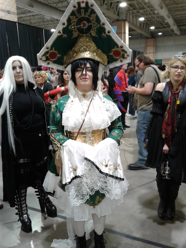
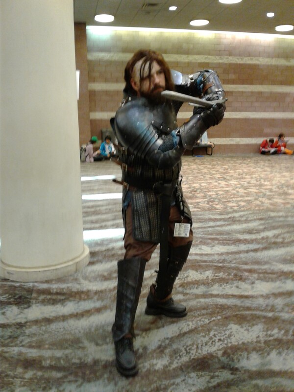
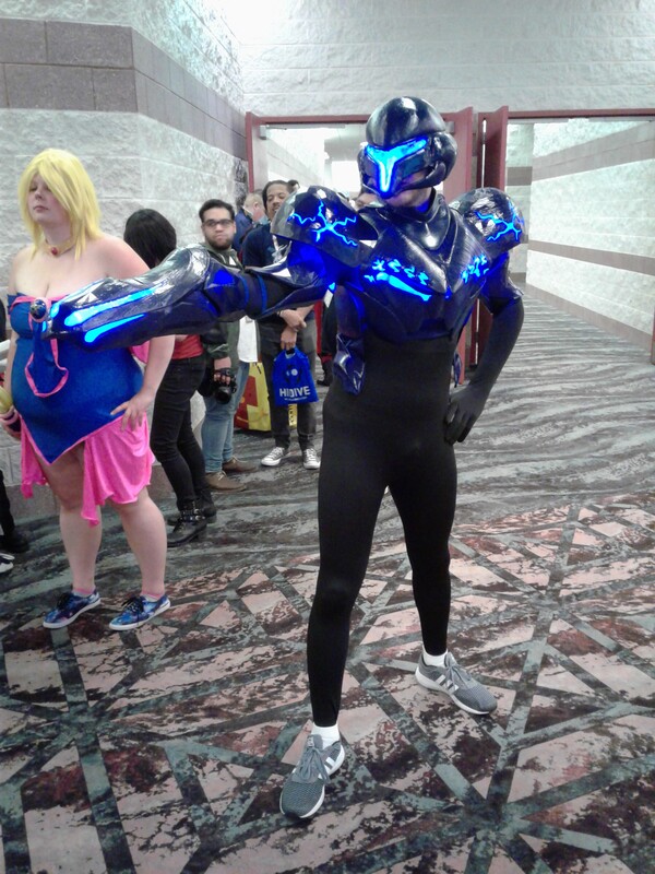
A couple characters I don't recognize, but their costumes looked cool:
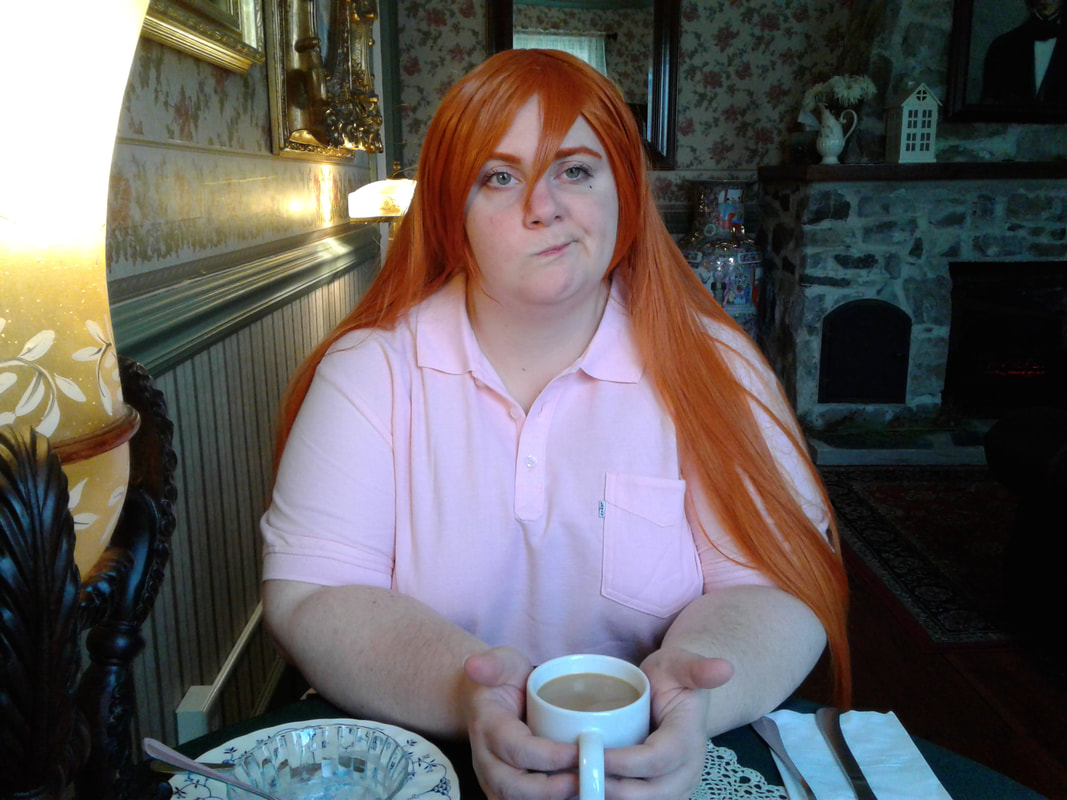
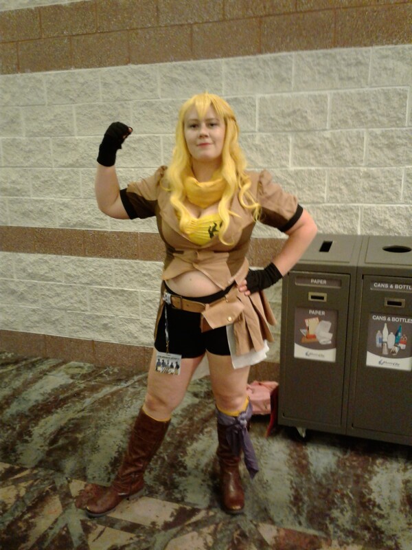
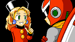
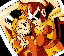
Some woman I'm married to, cosplaying as Tamako from Silver Spoon and then Ujibe from Keijo!!!!!!!! in an alternate outfit:
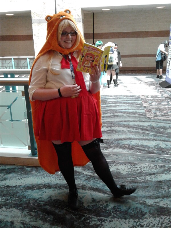
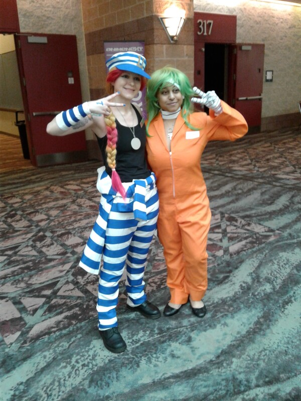
Umaru from Himouto! Umaru-chan, Uno and Nico from Nanbaka, Ryuko from Kill La Kill, and Dark Samus from the Metroid Prime series:
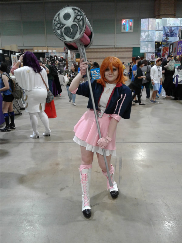
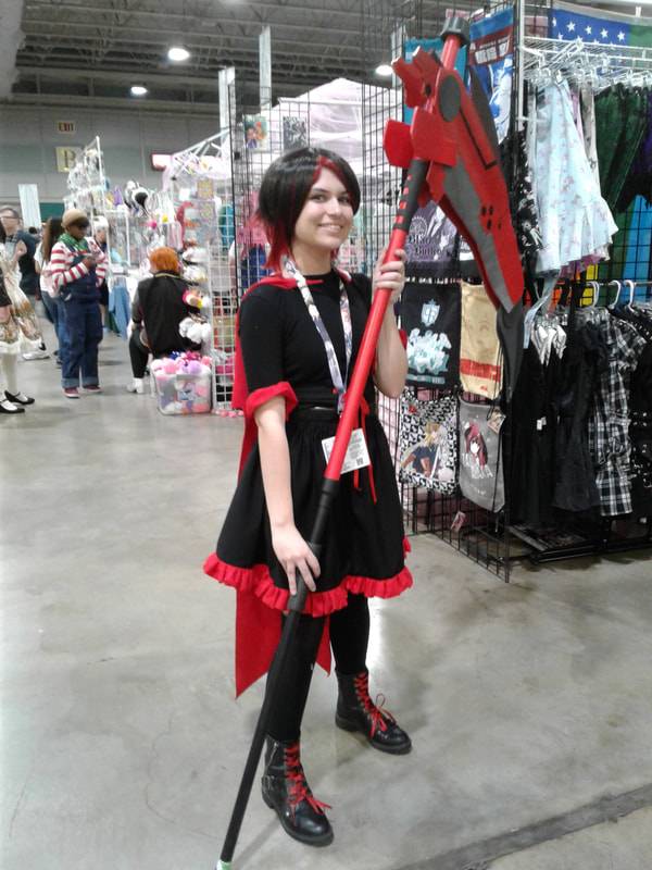
Nora, Ruby, and Yang from RWBY:
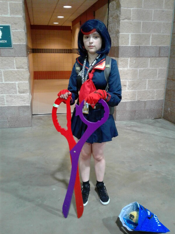
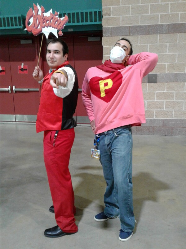
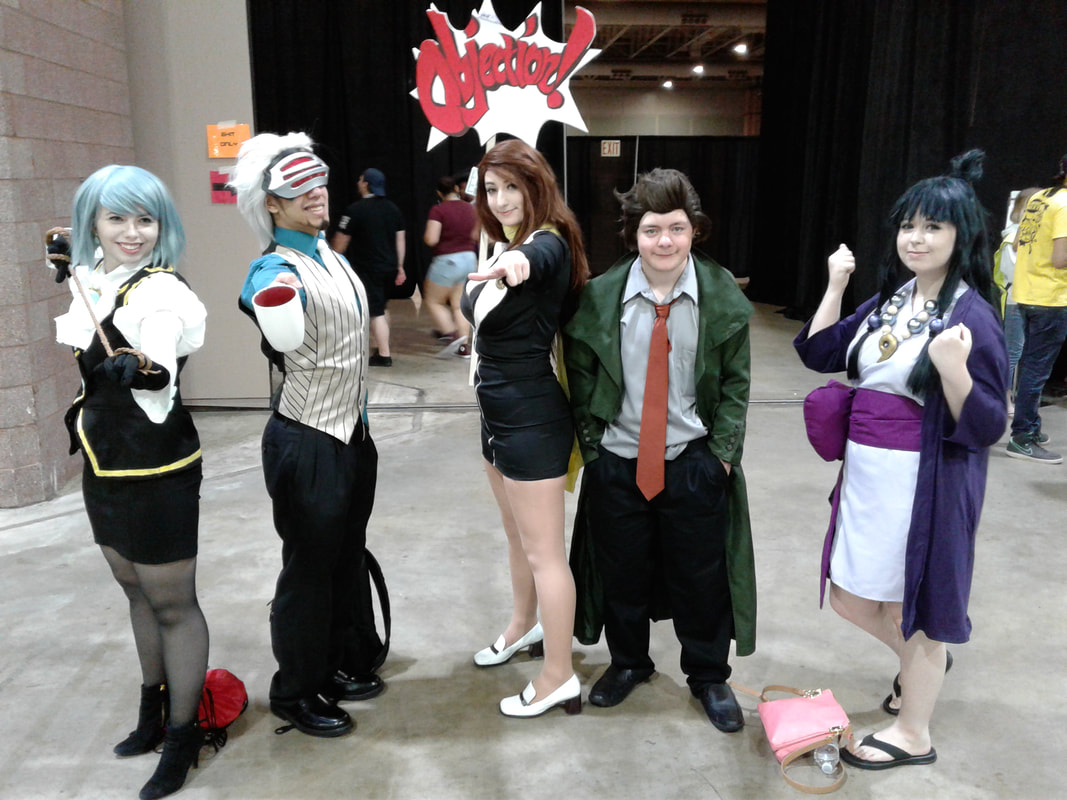
Buncha characters from the Phoenix Wright series:
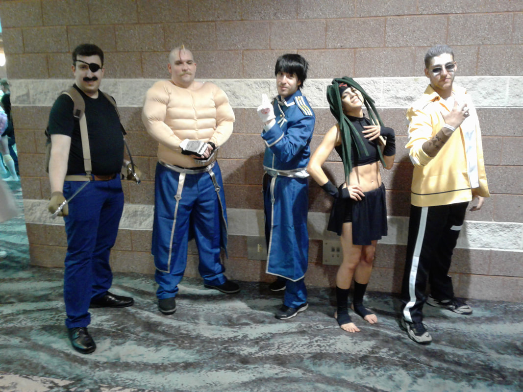
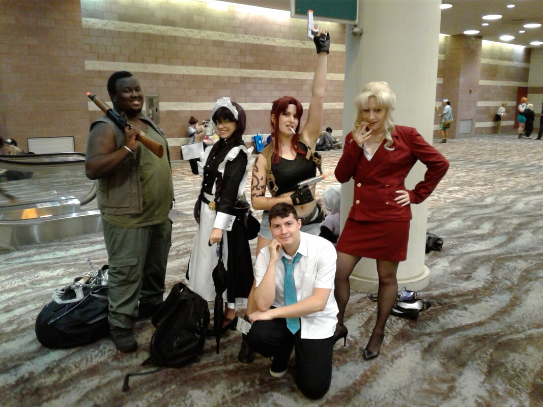
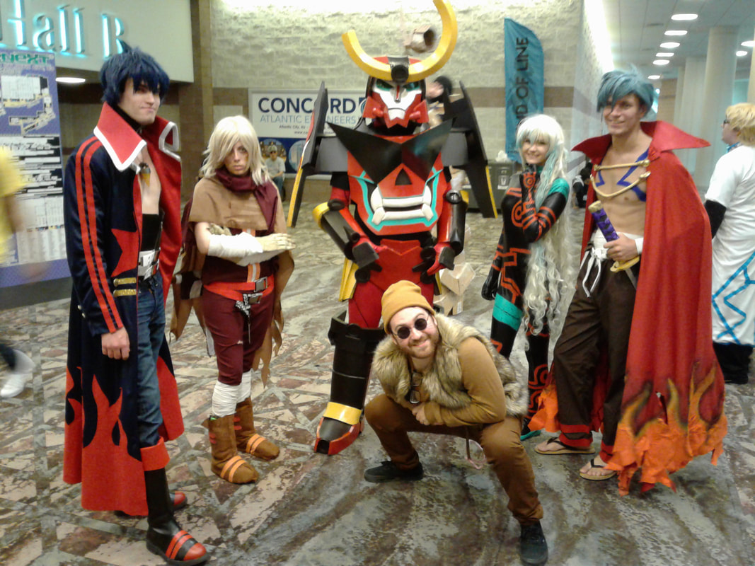
Lastly, some group cosplay from Fullmetal Alchemist, Black Lagoon, and Gurren Lagann:
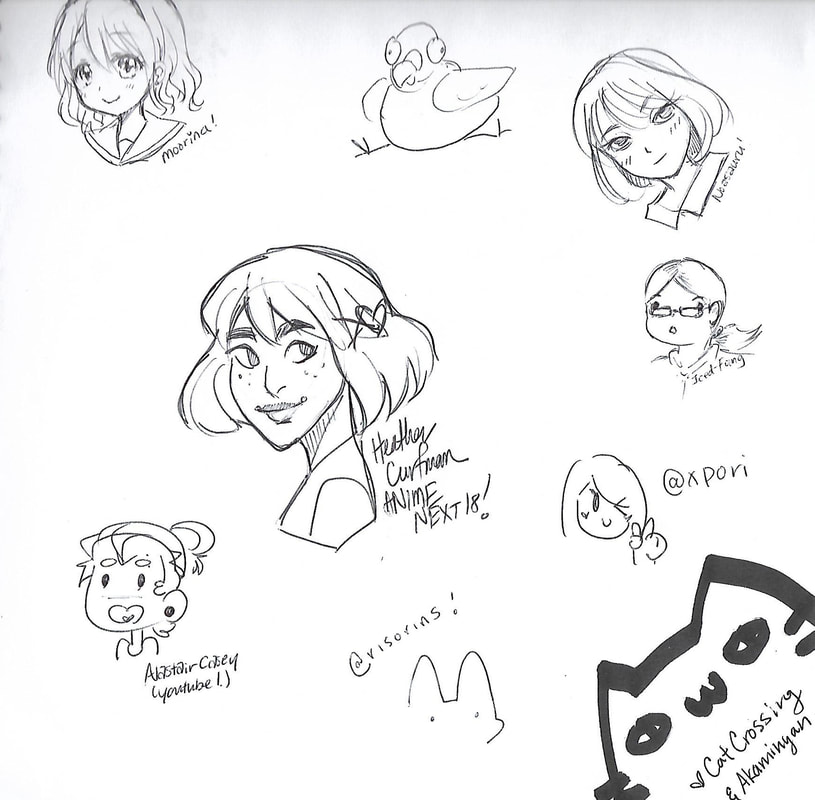
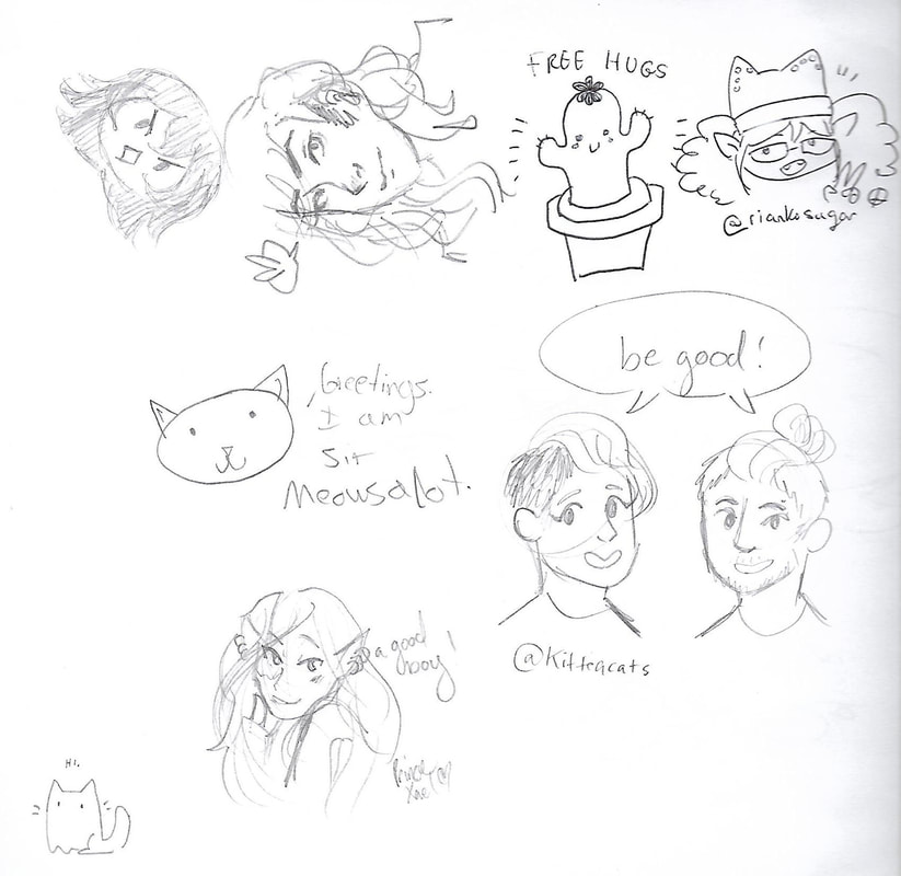
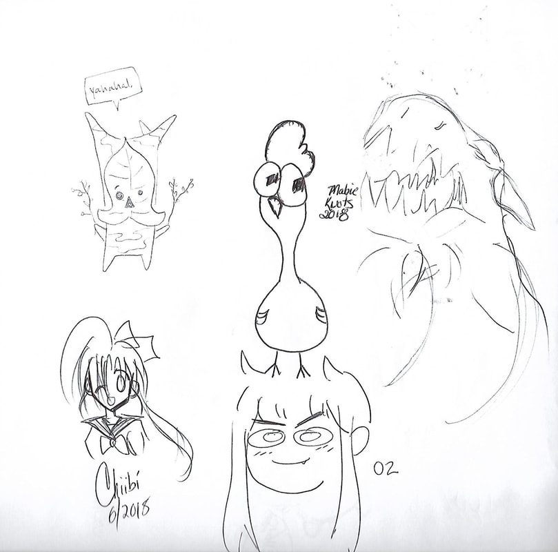
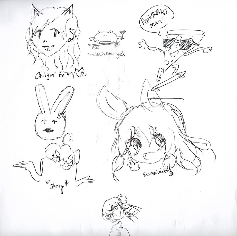
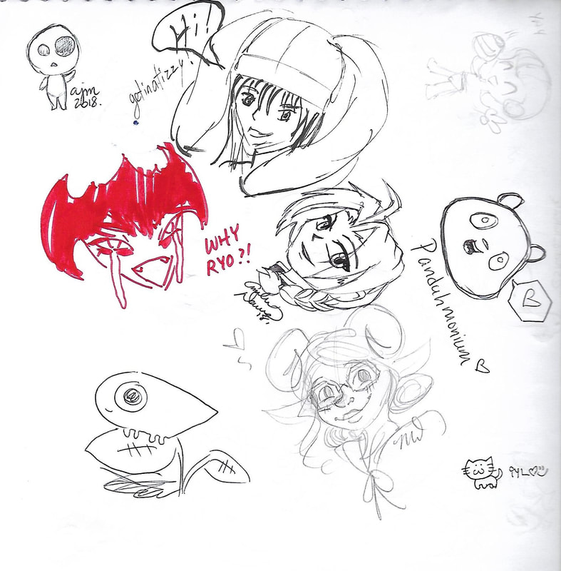
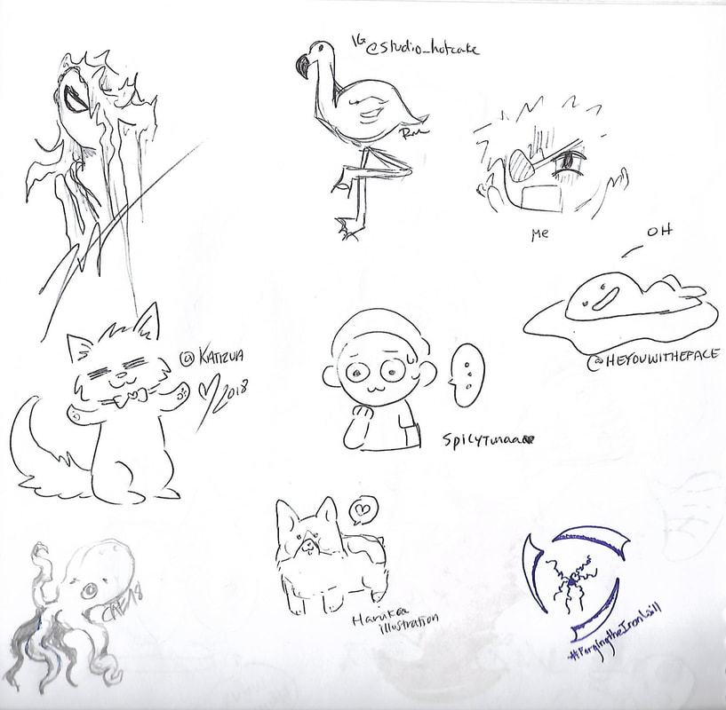
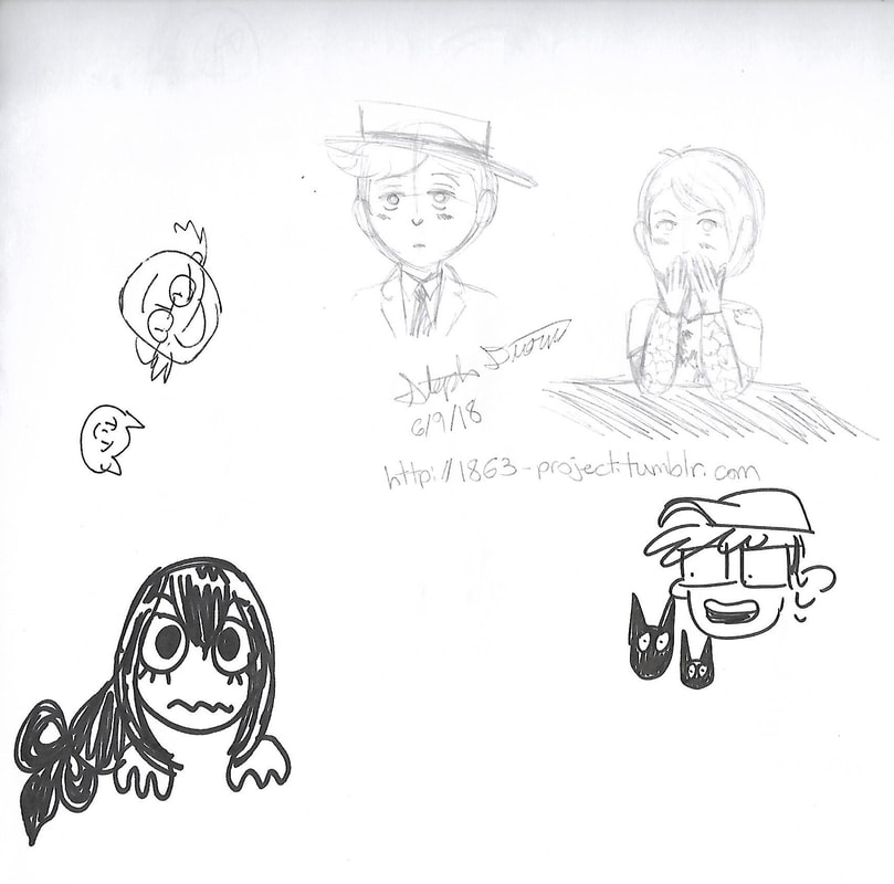
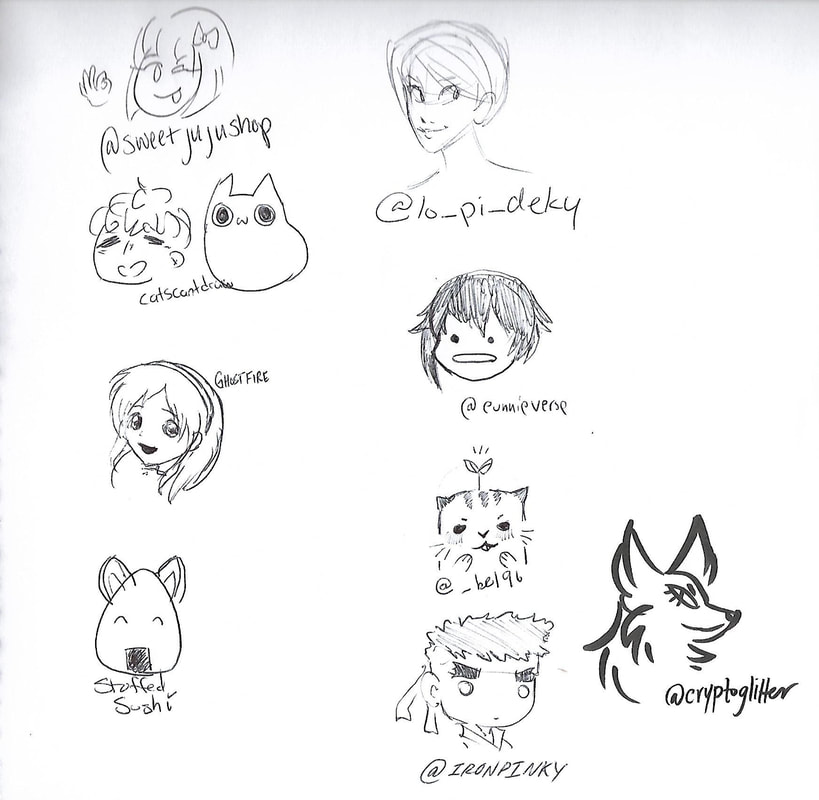
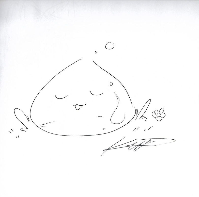
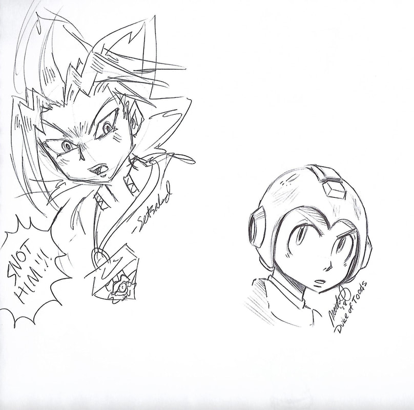
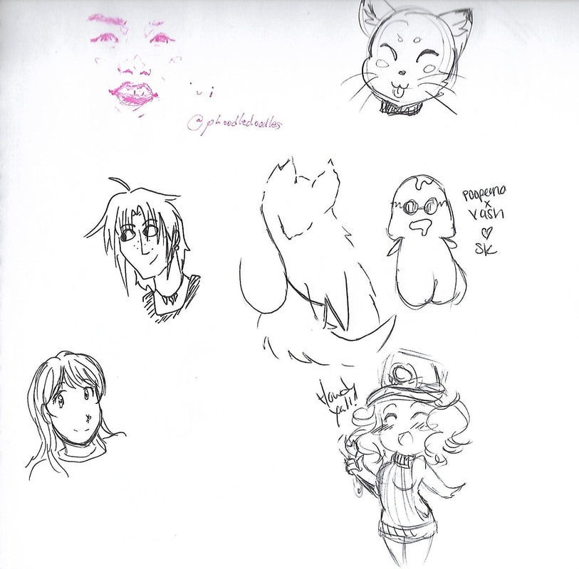
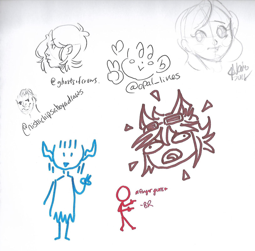
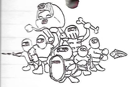
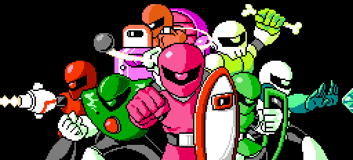
Ah, but that's not all. Carrying on with a tradition my wife started at the 2011 New York Comic-Con, I purchased a sketchbook and went around collecting doodles from the people at the booths in artist alley (regardless of whether they were an artist or just the person looking after the booth). These weren't formal commissions; rather, I asked for whatever they felt like drawing, if they felt like drawing anything in the first place. No pressure, no restrictions. Surprisingly, only one person drew genitalia.
Here are the sketches I collected—and as with the photos above, please contact me if your art is featured here and you'd like it to be removed or credited:
Here are the sketches I collected—and as with the photos above, please contact me if your art is featured here and you'd like it to be removed or credited:
So there you have it. AnimeNEXT 2018. At least, as much of it as is contained in this post.
 RSS Feed

