Story navigation: 1 | 2 | 3 | 4 | 5 | 6 | 7 | 8
I'm by no means an artist, but I'd like to think I have some measure of artistic ability. I like to doodle from time to time, I know my way around MS Paint, and I'm pretty decent at modifying and adapting other people's pixel art. At the very least, I'm capable of arranging foreground and background tiles in a manner that's aesthetically tolerable.
Unlike music and programming, I knew for sure I could handle the graphics for OH JOES! on my own. Menu graphics? I could keep those pretty minimal and adapt things as needed from the official Mega Man games. Level graphics? I could mix and match from existing Mega Man tilesets. Object sprites? Almost everything was already in the game engine. Really, all I needed were a title screen logo and an intro cutscene. The former was certainly easy enough:
I can hear you snickering. This, of course, was only a placeholder...though I was seriously tempted for a while to clean it up a little and abandon any semblance of professionalism. OH JOES! was already going to be a ridiculous, tongue-in-cheek romp; why not embrace the absurdity? I eventually tried to design a more traditional logo, using one of the Mega Man arcade game fonts as a template, but nothing looked right. I held onto this logo for basically the entire first year of development.
It wasn't until a fateful Discord conversation that my haphazard MS Paint logo was formally discarded. Someone I knew passed along an image file of the complete English alphabet in the style of the 8-bit Rockman title screen logos. This person couldn't remember who on Discord gave it to them, but they assured me that I had permission to use the graphics in my game. That was good enough for me. The file originator has been duly credited at the end of OH JOES! as "SOMEONE ON DISCORD WHOSE NAME I NEVER GOT." Thank you, anonymous benefactor. Please don't sue.
With the right title font at my disposal, I started piecing together a logo in MS Paint, manually resizing each letter to create the "swoosh" effect we've all come to expect. I was pretty happy with how it turned out:
As far as I was concerned, this was a final product. Now I could turn my attention back to the level graphics, which I had been gradually working on. My policy is to have a general idea in mind of how I want a stage to look, but to use placeholder tiles until I'm confident the level design is unlikely to undergo any radical alterations. More time spent refining the gameplay in its purest form; less time wasted on redecorating rooms.
Although the engine I was using already had dozens of (more or less) complete tilesets from the NES Mega Man games, I wanted to incorporate graphics from Mega Man 9 and 10. Make a Good Mega Man Level Contest 2 (which opened around the same time I was starting to think about this) offered tilesets of all the Robot Master stages from Mega Man 9. After a decent amount of sleuthing, however, I determined that the rest of Mega Man 9 and the entirety of Mega Man 10 were completely unaccounted for anywhere on the Internet. Thus began a side project that would benefit me and the whole fan community.
I launched a campaign to create tilesets for MM9/10, inviting other people to chip in if they felt like it. My plan was to rip tiles from the stages I wanted to use in my game, and then pick up any outstanding tilesets if I still had time, energy, and interest. This turned out to be a fun and satisfying little distraction; I got to use both my eye for detail and my penchant for organization, and I got a good amount of support from the community.
Within 24 hours, I'd produced three (more or less) complete tilesets, with graphics pulled from screenshot maps of the levels—the only things missing were animations for things like water tiles. A couple months later, with everyone's help, both games were almost done. I created my tilesets with flexibility in mind, adding transparencies instead of solid background colors wherever possible, and occasionally offering flipped or rotated tiles for things like spikes that only faced one particular direction in the actual level.
With as neat and tidy as my tilesets for MM9/10 were, you'd think my tilesets for OH JOES! would be pristine. You'd be wrong. The problem with mixing and matching from multiple tilesets is that you don't always know what tiles look good together until you've decorated the whole level...by which point it's a hassle to copy those individual tiles from their source tilesets, paste them and arrange them into a new tileset, and then redecorate the whole level using the new tileset. Consequently, the game's file size is larger than it should be because I am a lazy butt.
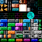
Stage 1, despite being only 13 screens long, uses two generic starfield backgrounds and (occasionally modified) tiles from Bomb Man, Knight Man, Plant Man, Star Man, Stone Man, Toad Man, Tomahawk Man, MM3 Wily 4, MM4 Cossack 1, MM4 Wily 2, and MM6 Wily 2. I eventually made an effort to consolidate, but I still ended up with seven different tilesets, 90% of which are tiles I never once considered using. The closest I have to a "main" tileset for Stage 1 is the Bomb Man tileset, with other tiles copy/pasted over the tiles I knew I didn't want to use. Even here, I ended up with a few tiles I didn't use.
Although the engine I was using already had dozens of (more or less) complete tilesets from the NES Mega Man games, I wanted to incorporate graphics from Mega Man 9 and 10. Make a Good Mega Man Level Contest 2 (which opened around the same time I was starting to think about this) offered tilesets of all the Robot Master stages from Mega Man 9. After a decent amount of sleuthing, however, I determined that the rest of Mega Man 9 and the entirety of Mega Man 10 were completely unaccounted for anywhere on the Internet. Thus began a side project that would benefit me and the whole fan community.
I launched a campaign to create tilesets for MM9/10, inviting other people to chip in if they felt like it. My plan was to rip tiles from the stages I wanted to use in my game, and then pick up any outstanding tilesets if I still had time, energy, and interest. This turned out to be a fun and satisfying little distraction; I got to use both my eye for detail and my penchant for organization, and I got a good amount of support from the community.
Within 24 hours, I'd produced three (more or less) complete tilesets, with graphics pulled from screenshot maps of the levels—the only things missing were animations for things like water tiles. A couple months later, with everyone's help, both games were almost done. I created my tilesets with flexibility in mind, adding transparencies instead of solid background colors wherever possible, and occasionally offering flipped or rotated tiles for things like spikes that only faced one particular direction in the actual level.
With as neat and tidy as my tilesets for MM9/10 were, you'd think my tilesets for OH JOES! would be pristine. You'd be wrong. The problem with mixing and matching from multiple tilesets is that you don't always know what tiles look good together until you've decorated the whole level...by which point it's a hassle to copy those individual tiles from their source tilesets, paste them and arrange them into a new tileset, and then redecorate the whole level using the new tileset. Consequently, the game's file size is larger than it should be because I am a lazy butt.
Stage 1, despite being only 13 screens long, uses two generic starfield backgrounds and (occasionally modified) tiles from Bomb Man, Knight Man, Plant Man, Star Man, Stone Man, Toad Man, Tomahawk Man, MM3 Wily 4, MM4 Cossack 1, MM4 Wily 2, and MM6 Wily 2. I eventually made an effort to consolidate, but I still ended up with seven different tilesets, 90% of which are tiles I never once considered using. The closest I have to a "main" tileset for Stage 1 is the Bomb Man tileset, with other tiles copy/pasted over the tiles I knew I didn't want to use. Even here, I ended up with a few tiles I didn't use.
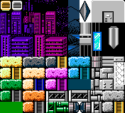
I learned my lesson for Stage 3 (which I inexplicably began tiling before Stage 2). I picked just one tileset (in this case, the opening cutscene of MM2) and pasted in whatever additional tiles I thought I might use. I envisioned something like MM3 Wily 1 (visually, my all-time favorite fortress stage), but with a nighttime cityscape for the outdoor portions, a different color palette, and accents from other tilesets to keep it from feeling like a lazy ripoff. The first iteration of the tileset looked like this...
...but I quickly realized that, as much as I love gray and silver, the level was going to need more color. I devised an easy fix for the monochromatic blues: color-code the different gimmick paths. This helped inform the aesthetics for Stage 2, because I just used the generic techno-block graphics from MM2's middle Wily stages and repainted them to match whatever colors Stage 3 used for each gimmick. Pasting new tiles over the ones I wasn't going to use, I came up with this:
I had been looking forward to using more unconventional colors and color combinations in my game. Much to my eternal sadness, the level quickly went from too dull to too bright. Moreover, I determined that the cityscape background was never going to work in a vertically oriented level; it'd look awfully suspicious to see the same ground level at multiple elevations. Grudgingly, I adapted some background tiles from Blade Man's stage and filled in everything after the first two screens with unassuming bricks. I fully intended to throw in a few miscellaneous details to liven up the backgrounds—maybe snaking pipes or gaping holes or wall fixtures of some sort—but nothing ever looked quite right. I tried to compensate by adding accent blocks to the foreground instead. Ultimately, my Stage 3 tileset looked like this:
This proved to be incredibly difficult to work with. Bear in mind that I'm colorblind—at a glance, I can't always tell which tiles are supposed to go together. I frequently found myself making small adjustments to the level architecture, only to have my playtesters report a random purple block in the midst of a blue area, or two different shades of background tile for no good reason. When I got around to decorating Stage 2, I made sure to start with a blank tileset and then paste in only the tiles I wanted to use, arranged in a way where there would be no color confusion.
This one's a lot cleaner, but you can probably tell by the placement of certain tiles that I changed my mind a couple times about how the background should look. After settling on the subdued brick background for Stage 3, I abandoned the subdued circuitry background for Stage 2 and started gathering tiles that were subtle but varied. One particular element of subtlety was how I would telegraph the length of the stage: at the first checkpoint, there are six red circles in the background; at the next checkpoint, there are five; at the next, four; and so on. I'm fairly certain no one has ever noticed this, let alone found it useful.
As a side note, the "screen" tile used for the pass-through "fake block" gimmick was only supposed to be a placeholder. However, by the time I got around to applying real graphics, I couldn't imagine the blocks looking any other way. They were distinctive (I never wanted the player to guess whether or not a block was solid), and I found them visually appealing both alone and as part of a group. Something similar happened with the Chill Man ice blocks—they were meant to shatter into shards like they do in MM10, but I left in the placeholder explosion animation so long that I eventually couldn't imagine them any other way. I like to pretend they're made of some frozen volatile liquid instead of water.
In order to streamline the tiling process, I decided that each stage's graphics should be governed by a set of rules. There were all the general ones, taught to me by the official Mega Man games: background tiles should always have a shadow on top when placed below a ceiling or platform; bottomless pits should be clearly marked by the background fading to black, etc. Then there were the rules I concocted to prevent me from spending more time than necessary analyzing the aesthetic merits of every single tile combination.
For example: When used specifically as the featured gimmick, ladders were represented with a traditional "hole between the rungs" ladder tile; when used in any other capacity (ie, just to get the player from one screen to the next), they were represented with the charmingly chunky MM1-style ladder tile. In Stage 1, the underground rock tiles had to be contained by pipes and pillars; the player was never allowed to come directly in contact with the rocks. In Stage 2, the foreground tiles had to follow the same repeating pattern across every screen, with every passageway looking like it had been carved out of that pattern. In Stage 3, wall bricks were never allowed to be floor tiles; horizontal pipes had to be used instead, endcapped by blocks that followed their own set of rules, and those pipes generally had to continue extending horizontally until they reached the end of the wall or platform. Obsessive? Yes. But also immensely helpful.
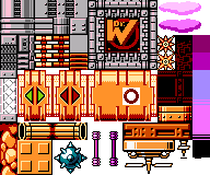
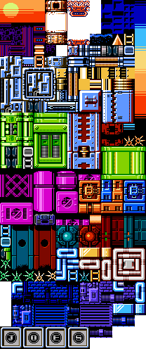
Rules were especially beneficial by the time I got to Stage 4, which effectively utilized five completely different tilesets—one for each set of gimmick paths, and one for the connecting hub areas. I had been somewhat conservative in tiling Stage 2 and Stage 3, trying to keep the focus on the increasingly complex gameplay and not distract too much with the graphics. Now, a little tired of playing it safe (and armed with all the newly ripped tilesets from MM9-10), I pulled out all the stops and put my artistic mettle to the test.
Bold color combinations. Intricate designs. Unnecessary attention to detail, like making sure to use a specific type of square tile behind every Sheep Man block, making it feel like the blocks take out a chunk of the wall when they disappear. It took a great deal of time and effort to decorate this massive stage, but I was very satisfied with the results. I even think the tileset, though not perfect, turned out pretty darn well:
In order to streamline the tiling process, I decided that each stage's graphics should be governed by a set of rules. There were all the general ones, taught to me by the official Mega Man games: background tiles should always have a shadow on top when placed below a ceiling or platform; bottomless pits should be clearly marked by the background fading to black, etc. Then there were the rules I concocted to prevent me from spending more time than necessary analyzing the aesthetic merits of every single tile combination.
For example: When used specifically as the featured gimmick, ladders were represented with a traditional "hole between the rungs" ladder tile; when used in any other capacity (ie, just to get the player from one screen to the next), they were represented with the charmingly chunky MM1-style ladder tile. In Stage 1, the underground rock tiles had to be contained by pipes and pillars; the player was never allowed to come directly in contact with the rocks. In Stage 2, the foreground tiles had to follow the same repeating pattern across every screen, with every passageway looking like it had been carved out of that pattern. In Stage 3, wall bricks were never allowed to be floor tiles; horizontal pipes had to be used instead, endcapped by blocks that followed their own set of rules, and those pipes generally had to continue extending horizontally until they reached the end of the wall or platform. Obsessive? Yes. But also immensely helpful.
Rules were especially beneficial by the time I got to Stage 4, which effectively utilized five completely different tilesets—one for each set of gimmick paths, and one for the connecting hub areas. I had been somewhat conservative in tiling Stage 2 and Stage 3, trying to keep the focus on the increasingly complex gameplay and not distract too much with the graphics. Now, a little tired of playing it safe (and armed with all the newly ripped tilesets from MM9-10), I pulled out all the stops and put my artistic mettle to the test.
Bold color combinations. Intricate designs. Unnecessary attention to detail, like making sure to use a specific type of square tile behind every Sheep Man block, making it feel like the blocks take out a chunk of the wall when they disappear. It took a great deal of time and effort to decorate this massive stage, but I was very satisfied with the results. I even think the tileset, though not perfect, turned out pretty darn well:
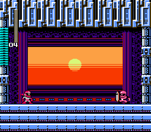
I'm especially pleased with the sunrise effect used in the boss chamber at the end of the game. For one thing, it completes the time-lapse effect I was going for—Regular Joe steals your shield when it's just getting dark, and you're chasing him through the night (seen at the start of Stage 3, which also shows the Bomb Man ball-on-stick buildings from Stage 1 in the distance), finally catching up with him just as the sun rises on a brand new, brighter day. For another thing, the sunrise kinda makes the background look like a Sniper Joe eye, which is the best backdrop for a Joe boss I could've hoped for.
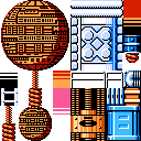
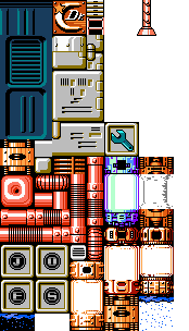
Easily the easiest stage to tile was Dr. Cossack's lab (unofficially, Stage 5). For posterity, here's the tileset for that one—note that the wrench icon was adapted from Mega Man & Bass, my first attempt at converting 16-bit graphics into 8-bit:
It took me 3 months to tile the 300+ screens that comprised the main gameplay. With one major graphical project out of the way, of course I decided to start another one. After successfully adding Break Man as a second playable character, I felt confident about adding an unlockable third character—one who would require custom sprites. I'd been making various graphical modifications throughout the entire development process, from updating Proto Man's sprite to reflect that his Proto Shield was missing, to giving Regular Joe his ridiculous walking animation cycle, to integrating the dome-shaped Quick Laser emitters (which were just random wall decorations from MM10) into existing wall tiles. I was ready for this.
It's always fun to see people's reactions to the secret character (whose identity I will be spoiling momentarily), because it's never whom they expect. For me, it was always obvious. I already had a character involved in the story who (a) deserved more air time, (b) would add some welcome diversity to a franchise dominated by male protagonists, and (c) was perfect "secret character" material. I was inspired by Castlevania: Rondo of Blood, which becomes a completely different game when you unlock Maria, an absurdly powerful little girl who throws cats at her enemies. I thought Kalinka Cossack would follow nicely in Maria's footsteps. Especially if she wielded an oversized bazooka that fired cats.
It's always fun to see people's reactions to the secret character (whose identity I will be spoiling momentarily), because it's never whom they expect. For me, it was always obvious. I already had a character involved in the story who (a) deserved more air time, (b) would add some welcome diversity to a franchise dominated by male protagonists, and (c) was perfect "secret character" material. I was inspired by Castlevania: Rondo of Blood, which becomes a completely different game when you unlock Maria, an absurdly powerful little girl who throws cats at her enemies. I thought Kalinka Cossack would follow nicely in Maria's footsteps. Especially if she wielded an oversized bazooka that fired cats.
Although OH JOES! takes place far enough in the Mega Man timeline that Kalinka is a teenager or even a young adult, I wanted to use her classic, younger MM4 look because I like the outfit and think it looks properly absurd when paired with a bazooka. Besides, nothing says her appearance or fashion sense had to change dramatically in the last decade or so.
From scratch, I drew something resembling a bazooka. I consulted reference photos of real-life bazookas, but I ended up going in more of a Worms: Armageddon direction. The only canonical Kalinka sprites I had to work with were two frames of animation from MM4, so I figured out how the bazooka should look in any given pose and then worked Kalinka's sprites around the bazooka. The trickiest part was creating the climbing sprite; I wanted the bazooka to be slung over her shoulder, but I was rubbish at redrawing the bazooka at a 45-degree angle. I may or may not have pasted the horizontal bazooka image into PowerPoint and rotated it to see how it should look. I'm not an artist, but darned if I'm not a problem-solver.
There are very few Mega Man games (official or otherwise) where you get to play as a human instead of a robot. I don't ask for a lot of realism in my Mega Man games, but one thing that's always bothered me is how human characters explode when they run out of health. I refused to let Kalinka explode like Proto Man and Break Man did—that'd just be lazy—so I made sure to give her a unique failure animation that made sense for a human, but without disrupting the lighthearted, family-friendly tone of the game. Hopefully, googly eyeballs and tiny cartoon birds circling overhead did the trick.
The last piece of the graphical puzzle to fall into place was the intro cutscene. Originally, my wife (who's the one with actual artistic talent in this relationship) agreed to do the art; she has a history of sneaking Mega Man–themed doodles into my lunchbox while I'm getting ready for work in the morning, and the cutscene was basically going to be a series of polished doodles. There were two major hurdles: one, she'd never done pixel art before; two, the screen dimensions with which she had to work (256 x 224 pixels, minus space for the dialogue text) imposed a difficult constraint. The project went on the backburner for a while, and when I started pushing to get the game released in early 2018, she was willing to pass the baton to someone with pixel art experience.
Fortunately, I already had volunteers. MJacquelinae, a fellow contestant in Make a Good Mega Man Level Contest 2, had previously reached out to see if I needed any help with the graphics for my game. I took her up on the offer and commissioned the mugshot of Kalinka used on the character select screen. When the intro cutscene went up for grabs, I asked if she'd be interested in tackling that as well. She sent me a rough panel sample that looked promising, but it turned out that her schedule and my timetable for release didn't match up.
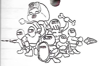
I had another offer on the table, this one from a longtime fan of both my YouTube videos and my writing. Based on his art samples and his taste in entertainment, I could tell he knew a thing or two about quality. I asked for one panel as a test run, a generic scene of Proto Man talking with Kalinka. Before the day was over, he sent me this:
From scratch, I drew something resembling a bazooka. I consulted reference photos of real-life bazookas, but I ended up going in more of a Worms: Armageddon direction. The only canonical Kalinka sprites I had to work with were two frames of animation from MM4, so I figured out how the bazooka should look in any given pose and then worked Kalinka's sprites around the bazooka. The trickiest part was creating the climbing sprite; I wanted the bazooka to be slung over her shoulder, but I was rubbish at redrawing the bazooka at a 45-degree angle. I may or may not have pasted the horizontal bazooka image into PowerPoint and rotated it to see how it should look. I'm not an artist, but darned if I'm not a problem-solver.
There are very few Mega Man games (official or otherwise) where you get to play as a human instead of a robot. I don't ask for a lot of realism in my Mega Man games, but one thing that's always bothered me is how human characters explode when they run out of health. I refused to let Kalinka explode like Proto Man and Break Man did—that'd just be lazy—so I made sure to give her a unique failure animation that made sense for a human, but without disrupting the lighthearted, family-friendly tone of the game. Hopefully, googly eyeballs and tiny cartoon birds circling overhead did the trick.
The last piece of the graphical puzzle to fall into place was the intro cutscene. Originally, my wife (who's the one with actual artistic talent in this relationship) agreed to do the art; she has a history of sneaking Mega Man–themed doodles into my lunchbox while I'm getting ready for work in the morning, and the cutscene was basically going to be a series of polished doodles. There were two major hurdles: one, she'd never done pixel art before; two, the screen dimensions with which she had to work (256 x 224 pixels, minus space for the dialogue text) imposed a difficult constraint. The project went on the backburner for a while, and when I started pushing to get the game released in early 2018, she was willing to pass the baton to someone with pixel art experience.
Fortunately, I already had volunteers. MJacquelinae, a fellow contestant in Make a Good Mega Man Level Contest 2, had previously reached out to see if I needed any help with the graphics for my game. I took her up on the offer and commissioned the mugshot of Kalinka used on the character select screen. When the intro cutscene went up for grabs, I asked if she'd be interested in tackling that as well. She sent me a rough panel sample that looked promising, but it turned out that her schedule and my timetable for release didn't match up.
I had another offer on the table, this one from a longtime fan of both my YouTube videos and my writing. Based on his art samples and his taste in entertainment, I could tell he knew a thing or two about quality. I asked for one panel as a test run, a generic scene of Proto Man talking with Kalinka. Before the day was over, he sent me this:
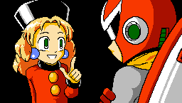
I was floored. This was exactly what I was looking for, and I had barely provided any direction. I showed the sample to my wife, and she was jealous of his artistic chops. I officially invited him to join the project, gave him the same copyright spiel I gave my composers, asked him how he'd like to be identified in the credits (he eventually settled on "Phusion"), and outlined what I wanted the cutscene to look like:
My thought was that in the first panel, Proto Man is walking through a doorway and taking off his shield, leaning it against a wall or otherwise leaving it conspicuously unguarded, with Kalinka in the corner to greet him.
After that, it's up to your discretion for the next several panels—the sample you gave me can be used for "Even the most interesting opponents...".
"Hey! Come back with my Proto Shield!" should feature Regular Joe (see attached) running away with the shield, and Proto Man in the background shouting at him.
For the panel about grabbing some weapon chips, I was thinking of featuring a cardboard box with little computer chips imprinted with the menu icons of a random assortment of weapons across the entire MM series—but that's just one idea; artist's discretion on what to do with that one.
If it gets to be too much to draw, it's totally feasible to reuse a few of the same panels and just change the facial expressions, too. I'm flexible about this, and I'm open to creative suggestions.
From there, we went back and forth—concept sketch, feedback, line art, feedback, full-color pixel art, feedback, updated pixel art. Throughout the process, I paid close attention to the logistics of the scene, making sure that the relative positions of Proto Man, Kalinka, the hanging Proto Shield, and the doorway were always sensible and consistent. Body language was paramount; not only did I want the characters' poses and facial expressions to convey their personalities and fit the tone of the dialogue, but I also wanted to make absolutely certain that Proto Man and Kalinka never looked like they might be flirting.
The whole process went extremely smoothly, and I think it helped that we were constantly communicating and collaborating. Phusion ended up doing much more than the intro cutscene; for starters, he updated the title screen:
The whole process went extremely smoothly, and I think it helped that we were constantly communicating and collaborating. Phusion ended up doing much more than the intro cutscene; for starters, he updated the title screen:
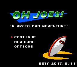
After providing feedback on the new logo colors, I commented, "The only thing I might do is flip and rotate it so that the shield is facing upward. Right now the shield looks almost like it's weeping tragically about having been stolen, but I'd like to see it optimistically waiting to be recovered." This is the kind of direction I give people.
Phusion also provided a new Game Over screen to replace the "boring text box" motif I had going. I had to make some programming adjustments to accommodate a static image where there was previously an interactive menu, but I think it was worth it. He turned my months-old concept art, doodled on a tiny notepad...
Phusion also provided a new Game Over screen to replace the "boring text box" motif I had going. I had to make some programming adjustments to accommodate a static image where there was previously an interactive menu, but I think it was worth it. He turned my months-old concept art, doodled on a tiny notepad...
...into something shockingly close to what I had been picturing in my head:
It's worth mentioning that Phusion was the second person to try adapting my scribbles into actual art. GavinDragon (who also provided cover art for the instruction manual I never ended up making) had previously taken a crack at it. I can't tell you how honored I am to have had anyone freely volunteer their talents for this game, let alone multiple people.
Phusion continued to tweak and tidy the Game Over art as we discussed changes—most notably, Regular Joe's fist. Again, I was looking closely at body language. As I described it, "Even though the player just got a Game Over and has shamed their family for generations, I think I'd like to have Regular Joe with a slightly less aggressive pose. Maybe an open palm, which could be read either as a shrug ('Eh, you didn't make it, oh well') or an invitation to try again. Alternately, a Sonic the Hedgehog-esque pointer finger ('Tsk, tsk. Shame on you.')—though I'm not as sold on that one." You wouldn't believe how much effort it took for us to settle on a suitable gesture. Well, maybe you would.
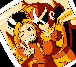
My favorite piece of art almost didn't make it into the game. Very late in the development process, Phusion surprised me with an old-timey photo of Proto Man and Kalinka, intended for use as a "thanks for playing" tag after the end credits. However, unbeknownst to him, the credits flowed directly into more gameplay. I couldn't come up with a decent way to add the photo without it feeling contrived, and it was too late to redo the whole ending. Thus, this super awesome picture that deserves more visibility was relegated to being a postgame Easter egg for the approximately zero people who close the game via the "QUIT" option on the title screen.
Phusion continued to tweak and tidy the Game Over art as we discussed changes—most notably, Regular Joe's fist. Again, I was looking closely at body language. As I described it, "Even though the player just got a Game Over and has shamed their family for generations, I think I'd like to have Regular Joe with a slightly less aggressive pose. Maybe an open palm, which could be read either as a shrug ('Eh, you didn't make it, oh well') or an invitation to try again. Alternately, a Sonic the Hedgehog-esque pointer finger ('Tsk, tsk. Shame on you.')—though I'm not as sold on that one." You wouldn't believe how much effort it took for us to settle on a suitable gesture. Well, maybe you would.
My favorite piece of art almost didn't make it into the game. Very late in the development process, Phusion surprised me with an old-timey photo of Proto Man and Kalinka, intended for use as a "thanks for playing" tag after the end credits. However, unbeknownst to him, the credits flowed directly into more gameplay. I couldn't come up with a decent way to add the photo without it feeling contrived, and it was too late to redo the whole ending. Thus, this super awesome picture that deserves more visibility was relegated to being a postgame Easter egg for the approximately zero people who close the game via the "QUIT" option on the title screen.
Level design may have been the most fun part of designing OH JOES!, but the graphics were the most satisfying. It's hard to put into words, but there's something deeply gratifying about nurturing a bunch of bland placeholder images into honest-to-goodness art, especially when I've got top-notch help.
 RSS Feed

